It ain’t work if you love what you do

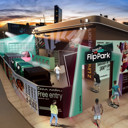

Inspired by the Samsung Galaxy Z Flip5, we worked with Samsung to create more than a skatepark...
The ideas was for it to be a new place to hang, share, create and express yourself.
Immersing guests in all the best elements of this world – from art to music, tech and fashion, encouraging everybody to unleash their inner skateboarder.
Concept Design, Manufacture and Install by Northbanks Design.


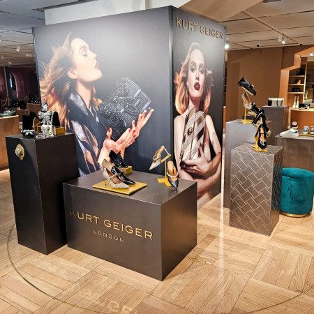
Northbanks were asked to design, produce, deliver and install this pop-up in the prestigious
Galeries Lafayette Haussmann store in Paris for their client Kurt Geiger to showcase the
brand's AW23 winter collection.
This activation is to support the brands first concession for the store to be launched SS24.
Concept Design, Manufacture, 3d Printing and Install all by Northbanks Design.


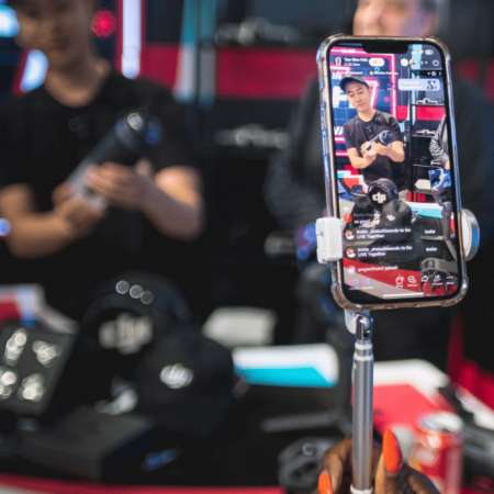

Tik Tok’s most recent activation with Northbanks is to launch the first-ever physical manifestation of TikTok Shop!
The space showcases the full capabilities of TikTok Shop, Northbanks has created a captivating pop-up store on Oxford Street, London, with two floors. The ground floor serves as a retail space for visitors to explore a wide range of unique and trending products, while the downstairs has experiential hubs that allow visitors to experience live shopping, create shoppable videos, and get hands-on with product showcases.
Concept Design, Manufacture & install all by Northbanks Design


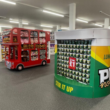

Working on this project in collaboration with the Innovation team, Northbanks redeveloped and redesigned everything from the customer journey, window displays and check-outs
-
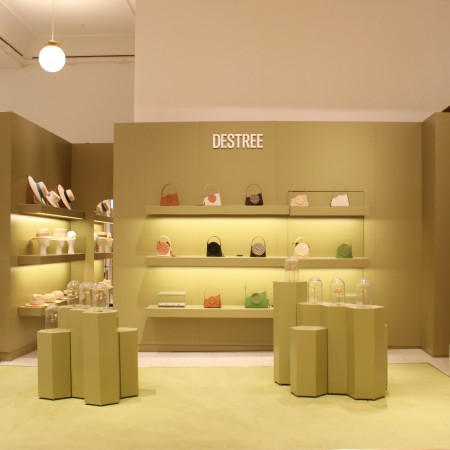

We were asked by our client to create Destree’s first retail activation pop-up in Selfridges London (The first outside of France) that hero the products and allows interesting visual merchandising product presentation and display.
They came to us because we have experience working with renowned department stores such as Selfridges and our history of bringing to life other retail activations and pop-ups there.
Destree wanted to pack a punch and reinforce their design which is why we decided to do the whole thing in their very on-trend green brand colour. Our intention was to create a retail space that stands out so that customers and passers-by would be attracted and be able to recognise it.
For Destree, we carried out the whole activation which included concept design, technical development & engineering, manufacture and installation. What sets us apart from other companies is our quick turnaround time - we delivered the whole project from brief to installation in less than 4 weeks.
Visual merchandising adds value to products by displaying them in a way that not only better exhibits the product, but can also achieve other goals – such as elevating the products so that they look more premium. This is important for a couple of reasons: Firstly, to introduce higher price point merchandise (and ranges with better margins), VM is used to better align the product with its competitors. This raises the perception and matches the customer expectation associated with higher-priced goods. Secondly, as current product ranges expand, they also need to look desirable and be displayed in a suitable manner accordingly.
The Destree install was only supposed to be a month-long retail activation pop-up, but because of its huge success; it is now going into its third month in Selfridges. This is why we believe in understanding the customer experience/journey because it can make all the difference which is reflected in the extension of this retail activation pop-up.
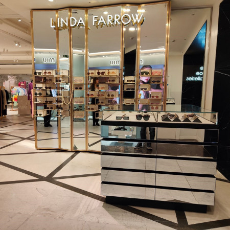
Northbanks were approached by Linda Farrow because of our experience working within renowned department stores such as Selfridges, and our history of bringing to life other retail activations, pop-ups and concessions.
Visual merchandising adds value to products by displaying them in a way that not only better exhibits the product, but can also achieve other goals – such as elevating the products so that they look more premium. This is important for a couple of reasons: Firstly, to introduce higher price point merchandise (and ranges with better margins), VM is used to align the product with its competitors better. This raises the perception and matches the customer expectation associated with higher-priced goods. Secondly, as current product ranges expand, they also need to look desirable and be displayed in a suitable manner accordingly.
For Linda Farrow, we carried out the full activation which included concept design, technical development & engineering, manufacture and installation. What sets us apart from other companies is our quick turnaround time - we delivered the whole project from brief to installation in a record amount of time.
We used mirrored panels to create a ‘luxury’ feel as well as it being an effective yet aesthetically pleasing way to better showcase the sunglasses. We also made sure that the panels used on the wall to showcase the glasses can be interchangeable in their placement on the wall, so the visual merchandisers at Selfridges can play around with the design when on the wall to update the display and create visual interest.
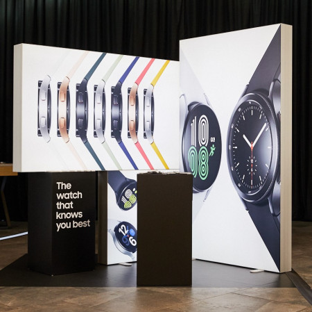

We were given a very vague brief for the new launch of Samsungs Flip 3 phone as it was still not released. We were asked by the client to create an array of displays that would highlight the key functionalities of the new phone. We were also asked to create displays that were aesthetically pleasing and intriguing to key press and influencers by encouraging social sharing with bold aesthetics
We used Samsungs signature branding throughout the designs for the displays and bursts of bright colours to make the displays attractive and photogenic.
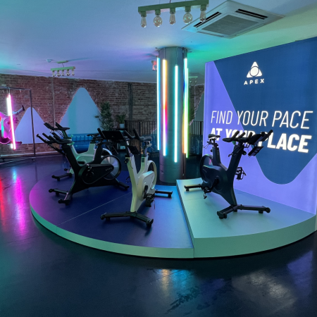

Northbanks were thrilled to be approached to design and manufacture Apex Ride's Covent Garden pop-up
The brand wanted a space that reflected their workouts; fun, energetic and a feeling of being at the club instead of a spin class!
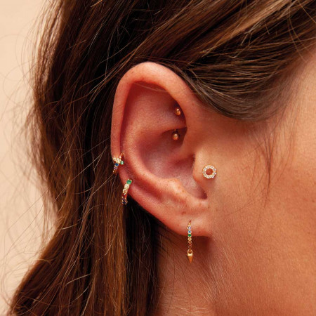

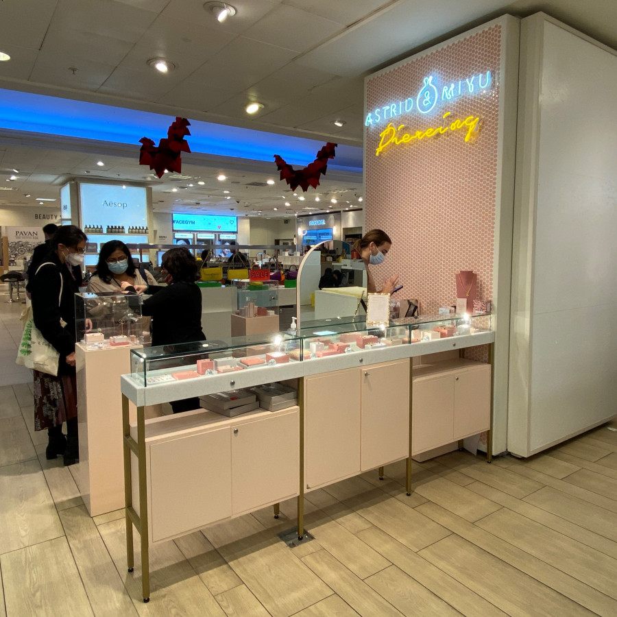
Following on from the success of our collaboration with Astrid & Miyu on their Covent Garden store, we partnered with them on their Selfridges concession scheme – with the first being London
Bespoke premium yet fun jewellery counters were paired with pink tiles and bright eye catching neon and LED signs to create a concession space that demands attention

-
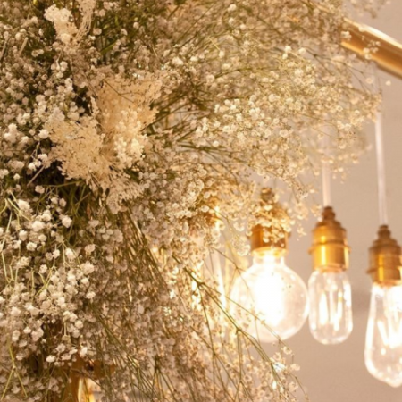

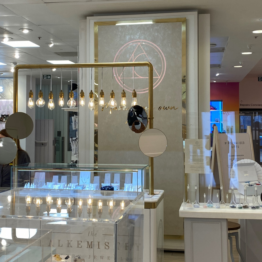
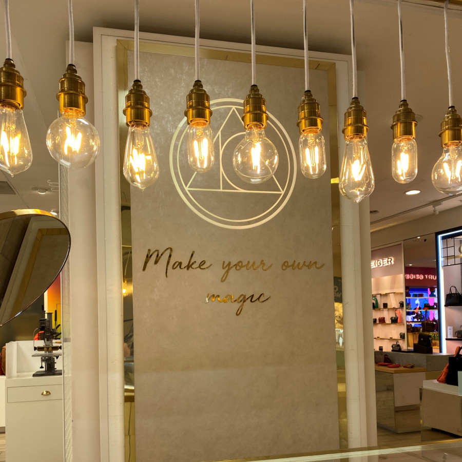
The Alkemistry approached us to for a quick turn-around project at London Selfridges with a lead-tiome of only 3 weeks, which included everything from concept, development, manufacture to installation!
Because of this, every aspect of the project had to be as efficient as possible... Having worked on a number of projects at Selfridges, including a Vivienne Westwood pop-up, Astrid & Miyu piercing bar, and various Skinnydip pop-ups and installations, Northbanks has successfully honed the process of working efficiently within this, and other department stores.
This prior knowledge and commitment proved crucial to the success of this particularly pressing, and impressive concept!
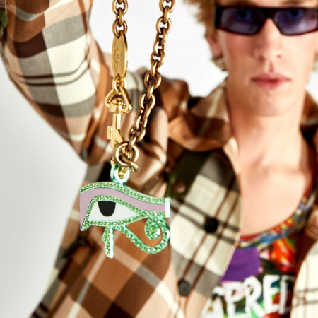
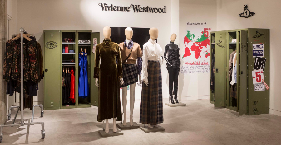
Vivienne Westwood partnered with Northbanks to create a Pop-Up space at Selfridges London, within the Designer Studio.
For this military themed pop-up is we designed and manufactured army surplus style lockers, emblazoned with Vivienne’s Climate Revolution graphics.
We also manufactured utilitarian style hang rails. A false stud wall was built, with a screen displaying digital connect of the campaign.
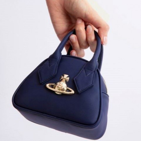

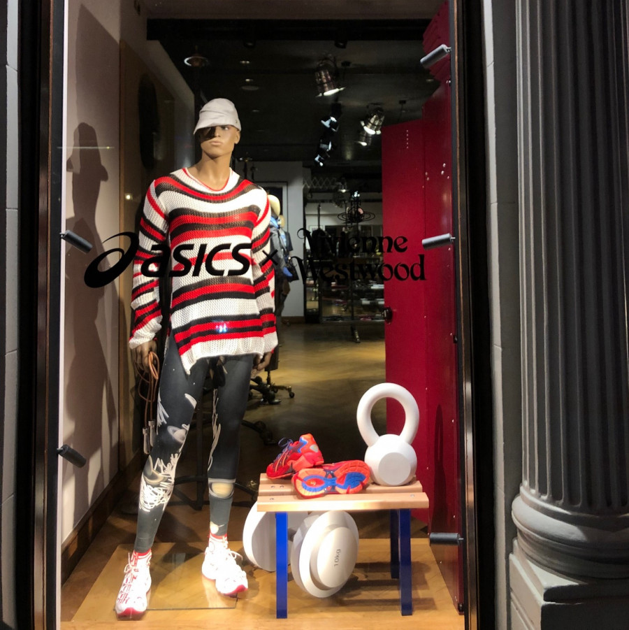
We partnered with Vivienne Westwood to create a window scene for their collaboration with Asics at their Conduit Store, London.
Inspired by the early punk years of Vivienne Westwood and their take on the workout scene.
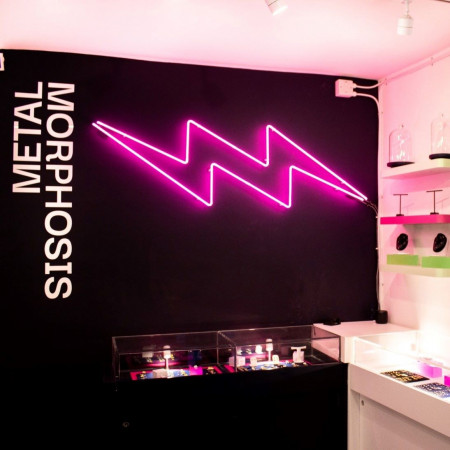
Dowsed in flashes of neon, the bijou space, located off Carnaby Street, houses a piercing studio, jewellery counters and merchandise.
This project required Northbanks to provide an array of services, including concept creation, development, technical development, manufacturing and full shop fit-out to turn the white box into the brand’s new flagship store.
Based on the brief, Northbanks designed SKU efficient POS with a combination of flexible vertical and horizontal surfaces that allow for more creative ways to display the jewellery. Displaying products in a visually aesthetic way not only better exhibits the product, but also elevates the product by raising the perception and matching the customer expectation associated with higher priced accessories.
Omnichannel optimisation was a major requirement when designing the concept to ensure that influencers and customers had the opportunity to share key aspects of the store.
James North, Founder and Designer at Northbanks commented, “Carnaby Street is such an iconic shopping destination with so many incredible brands, so it was very important to create a space that stood out and highlighted the very specific brand identity of Metalmorphosis
It has been a pleasure to work with James and his team on our new central store, the finished look is great! We’ve received nothing but positive feedback about the design and aesthetic of the store and have been thoroughly impressed with the communication through the entire project. As soon as an issue arises, James is always there to jump at it and help rectify. Thank you James and team Northbanks!
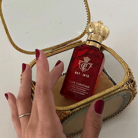

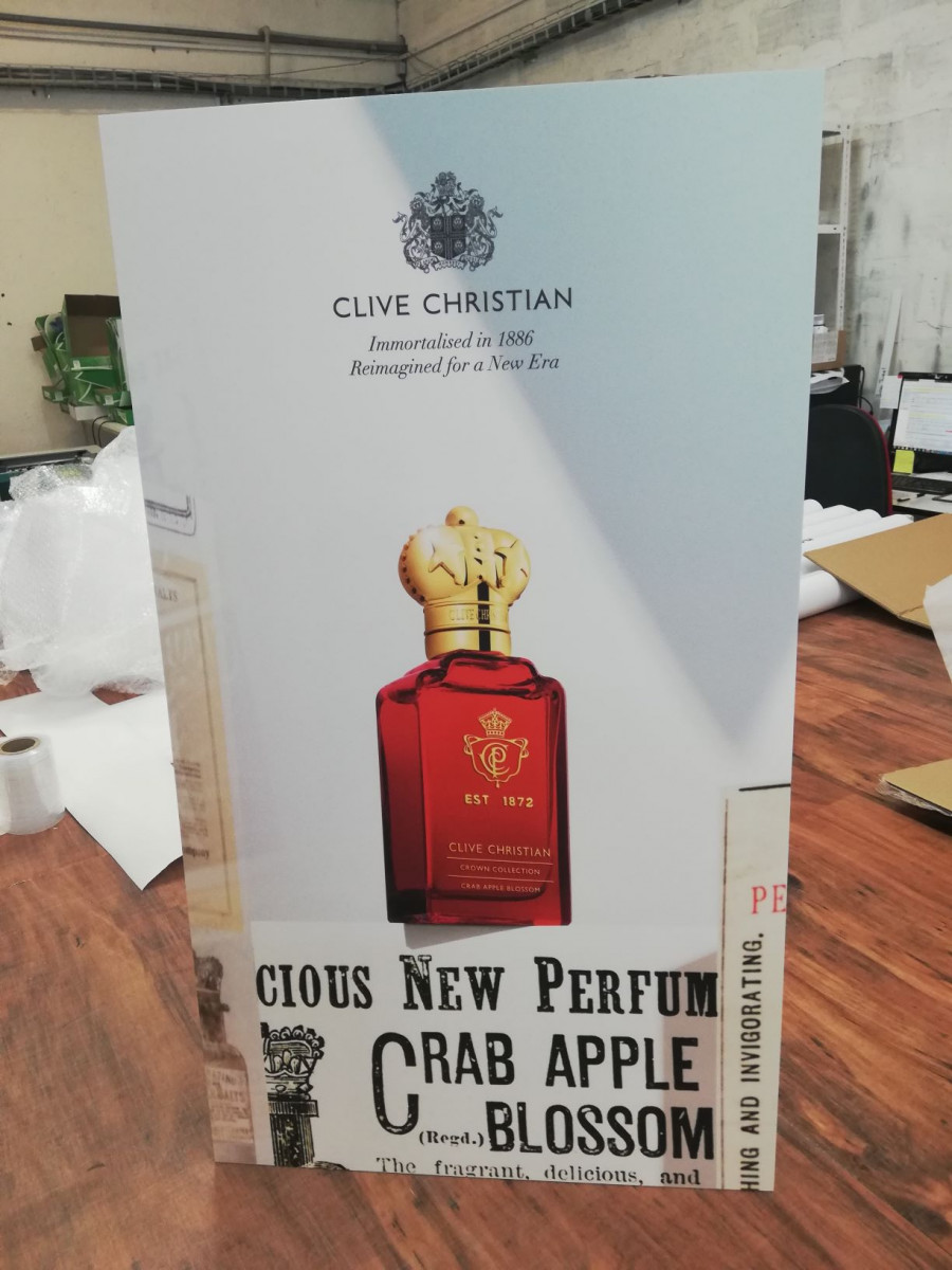
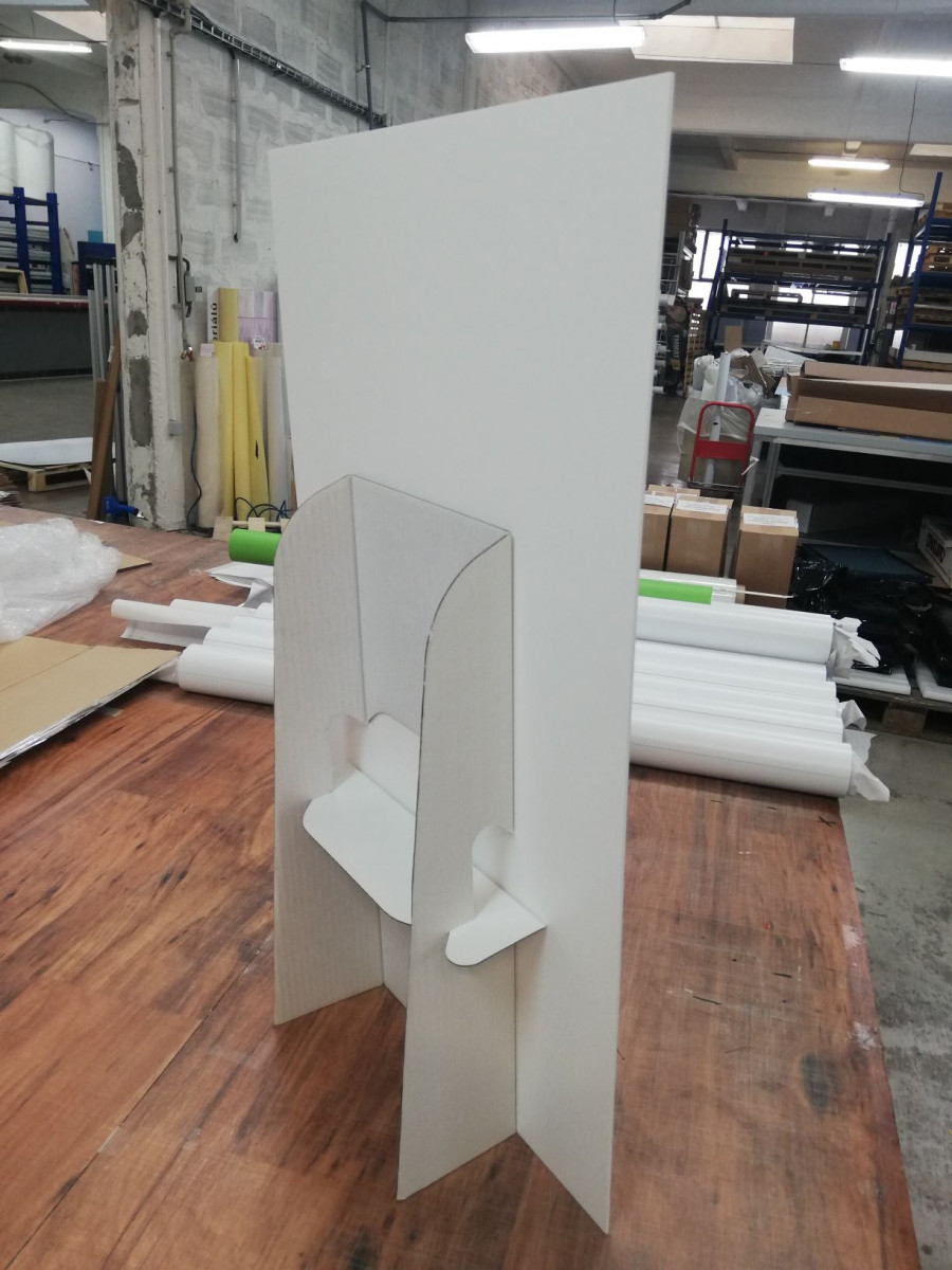
We worked with Clive Christian Perfume to create and rollout an FSDU for their upcoming product launch for Italy.
Using our Glocal (Global / local ) production capabilities we were able to fullfil their needs.
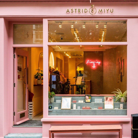


We partnered with Astrid & Miyu to create their new completely Instagrammable permanent store at 31 Neal Street in Seven Dials, Covent Garden.
The 100m² store split over two floors has been created with the same passion and quality as Astrid & Miyu’s products themselves.
By harmonising colours and textures, using soft blush tones, minimalistic materials and contrasting neon signs a chic and lux, yet understated interior was created, that is in tune with their brand identity and ethos.
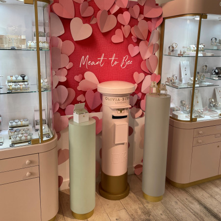

Here's a sneak peek at our Valentine's Day installation for Olivia Burton's Covent Garden store.
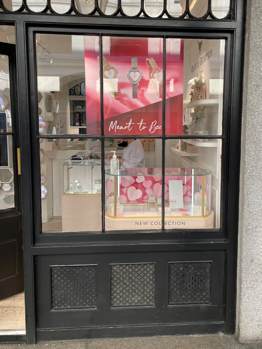
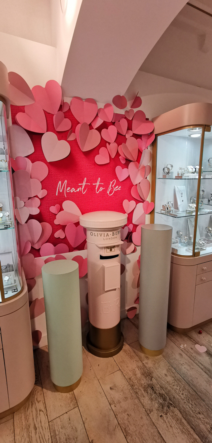
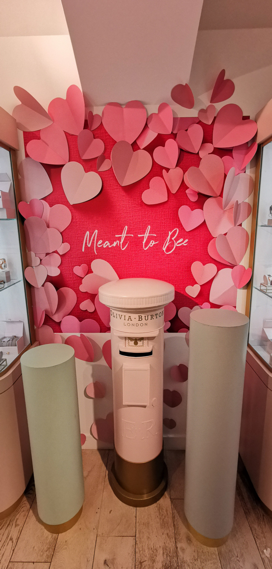
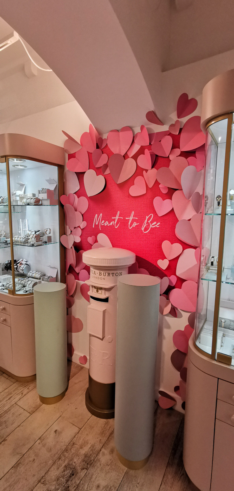

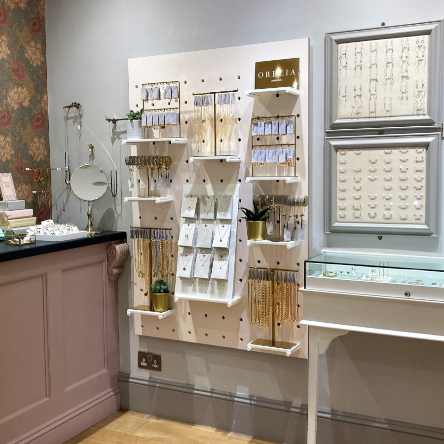
Orelia asked us to design, manufacture and install a range of wall fixtures for their boutique accounts.
We blended crisp white with their signature brass, to create a tactile and flexible system that showcases their jewellery rages.
The giant pegboard, mini pegboards and shelves house a range of POS that can be displayed dynamically.
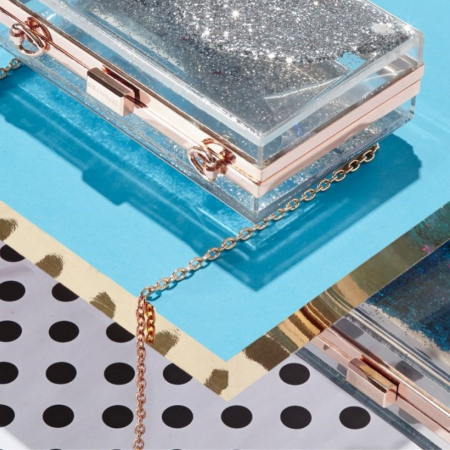
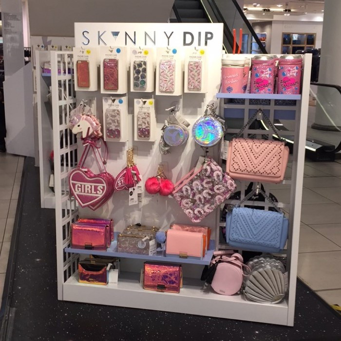
As these displays were going to be installed within multiple fashion retailers, such as Topshop and Selfridges, the design needed to be striking in order to help showcase Skinnydip as a cut above their competitors. Due to the limited space available within the stores, the gondolas also needed to be easy-to-install, without sacrificing the necessary dynamism to attract customers.
Working closely with the Skinnydip creative team we were able to build on and mould their initial ideas into very strong, vibrant, and above all compelling spaces that customers would gravitate toward. By focussing on the unique nature of the area that Skinnydip inhabit in order to promote and sell, we were able to put in process a design that used space limitations to our advantage.
We maximised on planogram production distribution, allowing for a wide product range to be displayed within a limited space. We felt that this not only opened up the opportunity for more sales, but also reflected the lively image of the brand and its customers. Each step of the way we made sure we incorporated Skinnydip’s brand image and values into the design to stay true to the products that our displays would be showcasing.
Our work with Skinnydip has proved to be a huge success, for both parties. The gondola display units enabled the client to successfully promote their brand within the crowded and ultra-competitive nature of the retail industry, reflected in an influx in sales, social media engagement and growth within the company. This has in turn led to us partnering with Skinnydip on more and more projects.

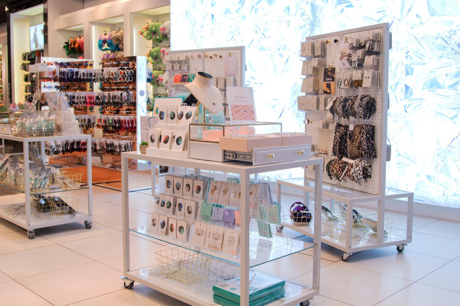
Orelia London tasked us to design, manufacture and install a range of fixtures and POS that could be rolled out across all their concessions and shops.
The client wanted a premium aesthetic to reflect the quality of their products combined with a flexible way to merchandise products. As a lifestyle brand, we included more flat surfaces to allow the opportunity to create aspirational displays.
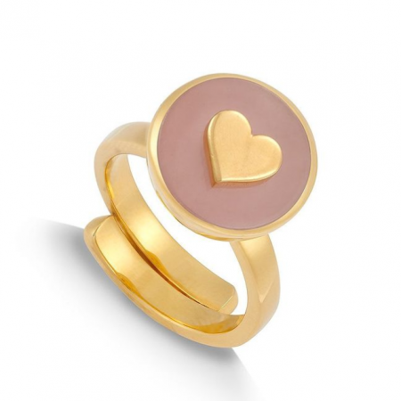

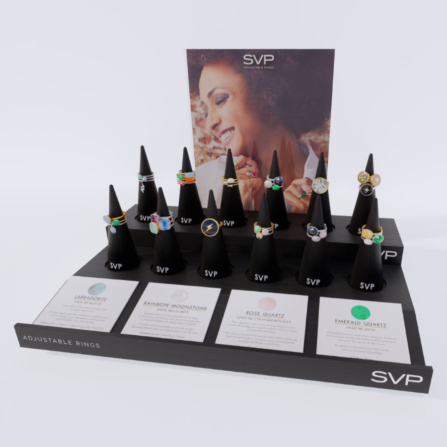
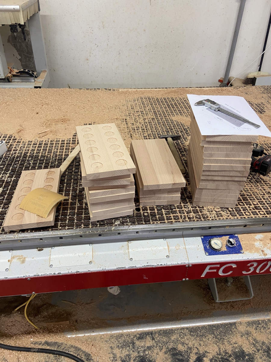
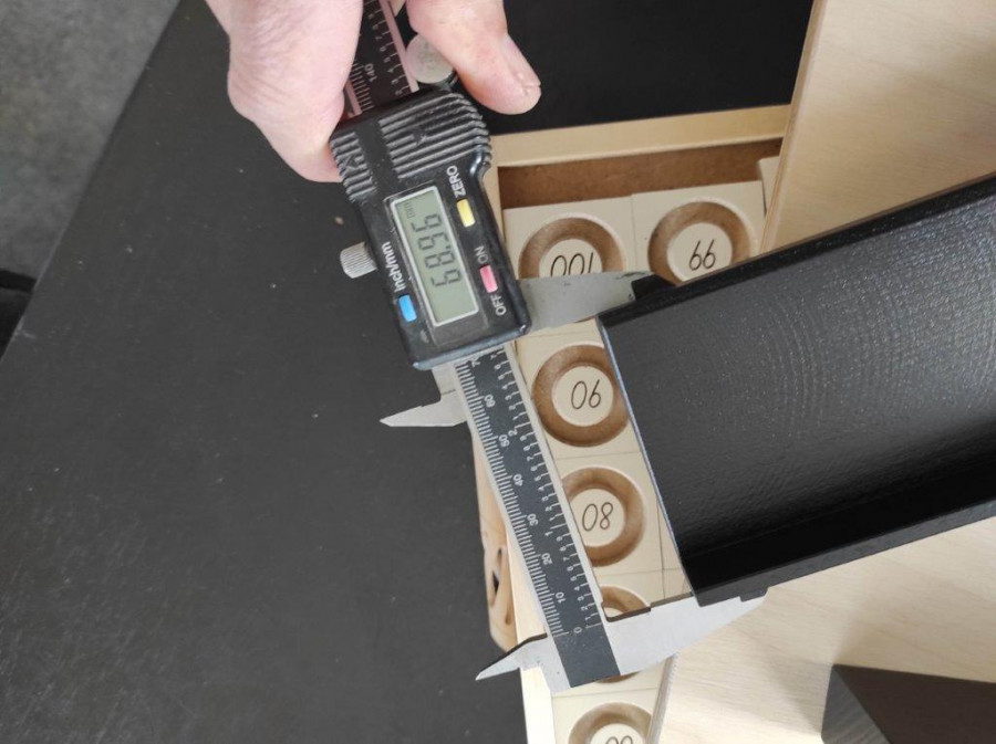
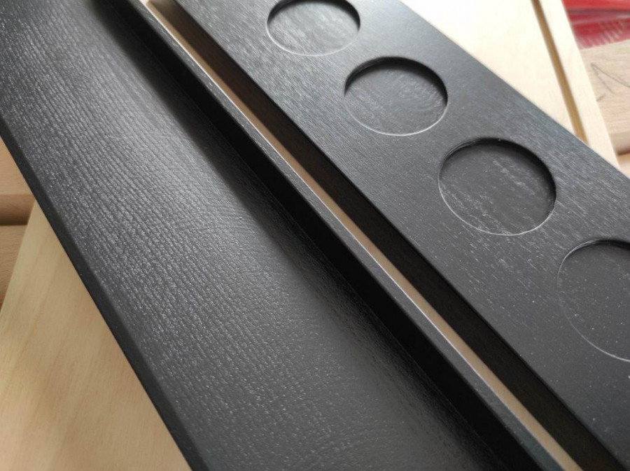
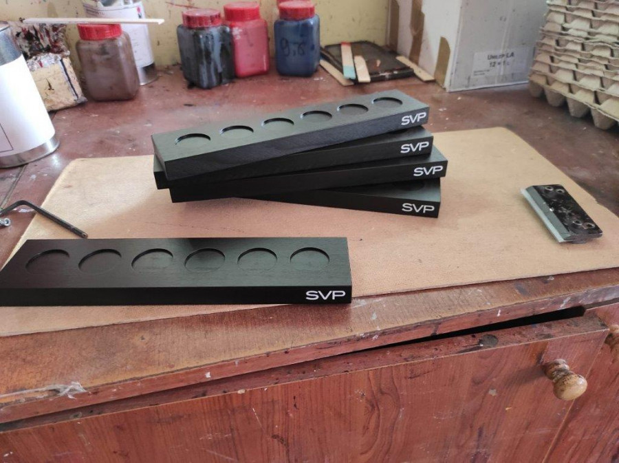
Here's a sneak peak of our POS kit for SVP Jewellery that is about to drop...
We designed, manufactured and rolled-out this eye-catching flexible counter top display POS kit, with the idea that each element can be bought, enabling brand followers to properly fit the adjustable rings using the Mandrel, whilst also being able display their SVP jewellery collection at home!
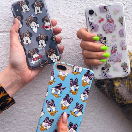

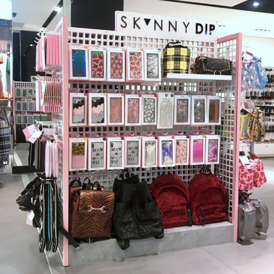
Having designed, developed and rolled out their previous hugely successful Topshop concession fixture suite, Skinnydip London returned to Northbanks to develop and roll-out a new scheme.
Designed in 3 different sizes to maximise SKU count for 4, 6 and 8 linear feet locations, with features such as a plinth to elevate products from the floor and grid walls which are very flexible and add futureproofing for Skinnydip London’s ever evolving product mix.
Bright pink reinforces the brand colour, a concrete effect plinth gives an edgy appeal, whilst a white backdrop allows the product to really pop.
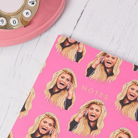

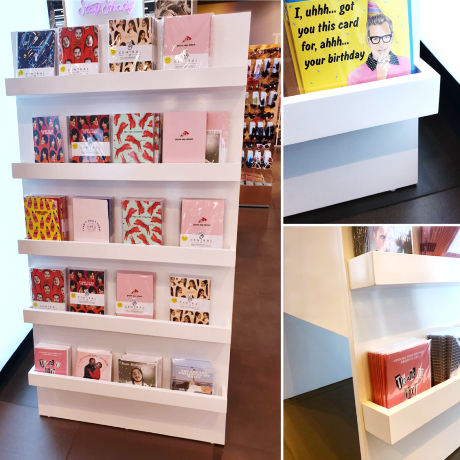
Central 23 chose us to develop, manufacture and rollout a cost effective but SKU dense display to merchandise their cards and journals in Topshop.
As Central 23 designs are vibrant and bright we didn’t want the display to steal the show, we wanted it to be clean, crisp and premium.
The A-frame design is strong and stable meaning we could maximise product count by having 5 shelves on each side yielding over 900 SKU yet taking up < 6Linear (c. 0.5m²).

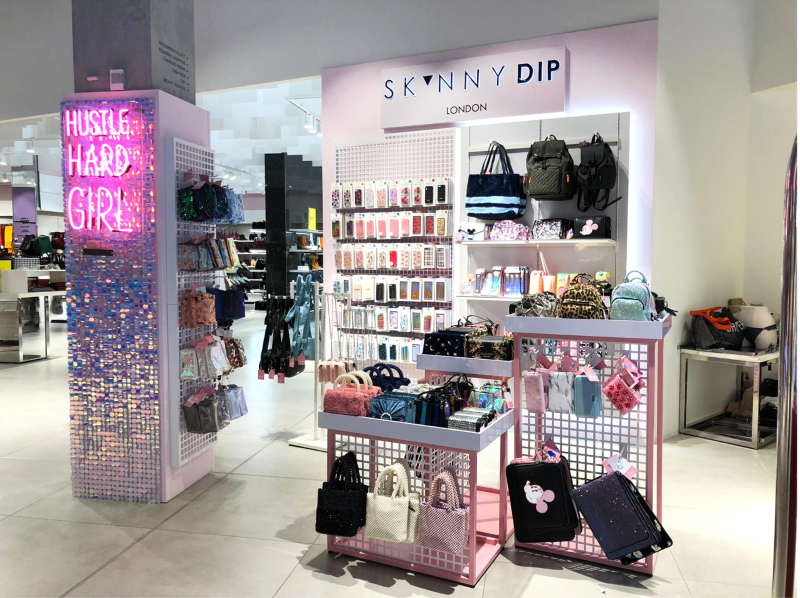
Continuing our partnership with Skinnydip London, we were asked to create a scheme for a nationwide concession roll-out in Topshop.
We wanted the area to be fun, vibrant and high impact to match the ethos of the brand.
Equally important was that it needed to be high capacity, flexible and quick to install (one night).
The design incorporated metal, joinery, LEDs, neon and not least sequined shimmer walls!
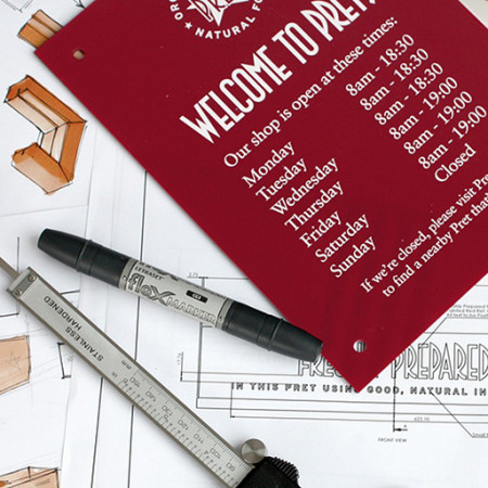

Brief: Design Door signage for Pret A Manger that fitted into the existing brand guidelines and defined style and feel.
Go into any large town or city in the UK and you are likely to come across a Pret A Manger, they have hundreds of locations, ranging from high-street stores to smaller concessions. Northbanks were asked to create signage that could be used for all of Pret’s shops, they needed to be easy-to-remove and be personalisable for each store.
We took this brief and created an interchangeable sign with suction cups, allowing for easy removal and one that could be read from both sides of the door. Using a blend of materials, we created a look that fitted into the well-established and recognised Pret brand, along with the functionality needed to be a success in stores up and down the country.

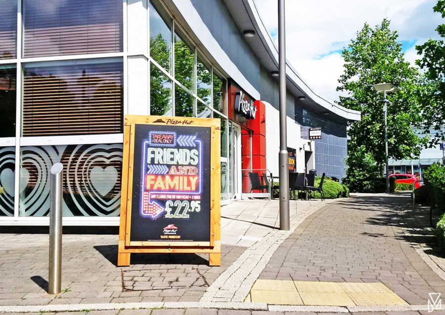
In search of new A boards designed to suit their new branding, Pizza Hut came to us to help them create the big impact they needed at the relaunch of the brand. Alongside the visual aspects of the design, it was also imperative that the signs could withstand harsh weather as they were produced as part of the pavement and outside signage proposition for the group.
Utilising our material knowledge and experience, we set about sourcing stylish yet hard wearing A0 size A boards with a highly durable treated wooden structure to ensure longevity. Having found the perfect solution a precise engraving of the brand was added in keeping with the design. The design of the boards fit seamlessly with their new branding, helping Pizza Hut to achieve the desired impact they were searching for after their relaunch.
Feedback from the clients on this project was overwhelmingly positive and better still the reaction from their customers was fantastic.
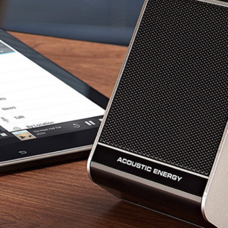

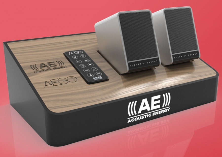
Brief: The team over at Acoustic Energy asked us to come up with some concepts for the launch of their new Bluetooth speakers. These designs were for interactive displays that fitted with their recently revamped brand guidelines whilst giving the customer the experience of hearing the quality of the product. These designs were intended for a national roll out in large department stores.
Being located in department stores, such as John Lewis, meant Acoustic Energy were after eye-catching, innovative designs that allowed their new speakers to stand out from their competitors. On the other hand, the displays had to be practical and hard wearing, whilst also maintain a creative element so as to entice customers to use the display.
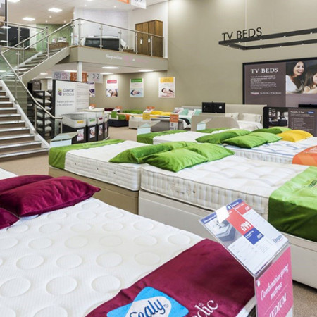

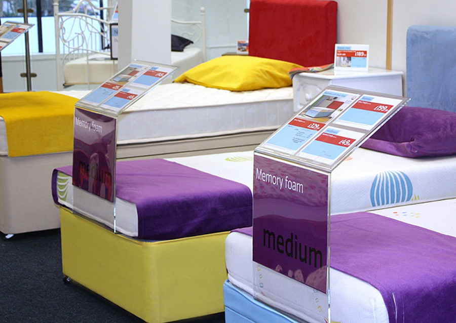
The new display stand had to be versatile, user-friendly, and coincide with the new Dreams Comfort by Colour scheme. Key to creating a solution for the brief was to first asses the products already installed in Dreams stores throughout the country and to identify the shortcomings of these offerings.
From there we were able to create a simplistic, yet dynamic, solution made out of clear acrylic in a design that would be unobtrusive to the retail floor space. Insistent that our design shouldn’t distract from the bed displays already in-store, a transparent colouring was decided upon so as to complement, not distract from, the existing store experience.
The Comfort by Colour Scheme has been a great success for dreams, with sales increasing dramatically within days of the new concept being launched and their status as Britain’s leading bed specialists cemented due to campaign. Through our success with this campaign we have developed a fantastic relationship with Dreams and continue to work closely with them, dealing with the procurement of displays in new and renovated stores.

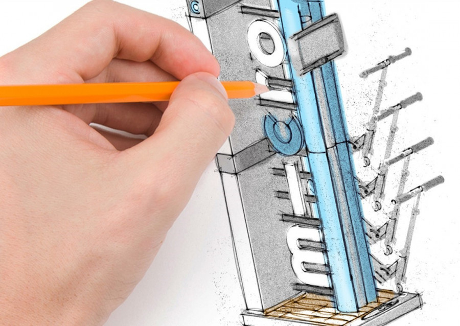
Brief: Micro Scooter asked us to design an FSDU that was not only functional and easy to store for the variety of retailers who stock the range, but one that would captivate its target audience and inspire a sense of fun within them.
One of the key elements that our design team were keen to showcase was the incorporation of the brand identity into the FSDU, whilst giving design nods to the product itself.